How Do the Media and Police Estimate Crowd Sizes?
 Although the task of determining how many people attend something as large as say, a political rally or a protest may seem like a daunting, almost impossible undertaking to do with any accuracy, with some basic information, it’s actually not that difficult to get reasonably accurate results. The most well-known method of estimating the size of a given crowd is simply called “The Jacobs’ Method” as an ode to its inventor, Herbert Jacobs. Jacobs spent a few decades working for the Milwaukee Journal before retiring into teaching journalism at the University of California, Berkeley in the 1960s. He thought up his very simple crowd size estimate method after observing numerous Vietnam War protests outside of his office window.
Jacobs noticed that the area the students stood on had a repeating grid-like pattern, meaning he could very easily count how many students occupied a certain amount of space by counting how many students on average seemed to be able to stand inside a section of the grid. By doing this, he soon noticed some patterns.
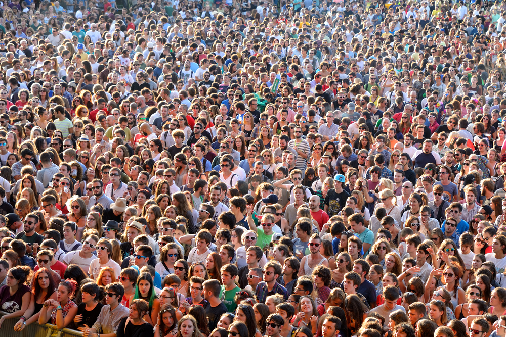
For example, Jacobs found that in the most densely packed crowds, each person took up approximately 2.5 square feet. We should note that this is the absolute upper limit of a how dense a crowd can safely get, as in, you simply couldn’t fit more people into a crowd this dense without someone being trampled or worse, which is probably why most, including some scholarly articles on the subject we read, simply refer to it as “mosh-pit density”. In a dense, but more manageable crowd, Jacobs observed that participants had a comparably more roomy 4.5 square feet whilst those in a “light” crowd had a positively breezy 10 square feet to themselves.
In any event, once he had the approximate average number of students in each grid, he could then easily calculate the number of grids in an area occupied at a given density, and quite quickly come up with a very good estimate of how many people were in a given crowd. Thus, the now Gold Standard, and remarkably simple, “Jacobs’ Method” was born.
This may sound like an overly simple solution but the truth is, it’s strikingly accurate when done by non-biased observers, and modern technology has only made it easier. For instance, tools like Google Earth have made learning the exact size and area of a location, as well as dividing an area into grids, an almost trivial feat for just about anyone. And thanks to ubiquitous media coverage, any large gathering of people is going to have video or photographic footage (if not just scanning the Tweetosphere for people in the crowd who may have gotten a good shot and posted it online). So breaking things down from there is relatively trivial. Of course, one could get really fancy and take a photo of an entire crowd and use a bit of custom designed image processing software to programmatically count the people in a crowd for a more exact number, but the extra level of accuracy here over the properly executed Jacobs’ Method isn’t really typically that much, nor all that necessary.
Of course, when giving estimations, sometimes the news media or the organisers of an event do like to fudge the numbers a bit. Perhaps the most famous example is that of the Million Man March- a mass gathering of African Americans (mostly men) that took place in 1995. As you can probably guess from the name of the march, event organisers afterwards were very insistent that at least a million men had attended, with estimates going as high as two million. However, the National Parks Service disagreed and offered up a much lower, but still extremely significant figure of around 400,000 individuals. But when something is called the Million Man March, 400,000 seems a bit of a letdown, even though it’s logically very much not; getting 400,000 people (about 1.2% of all African Americans in the United States at the time) to show up at such an event in Washington DC is really quite a feat.
Nevertheless, the NPS’s estimate incensed a key player behind the march, Louis Farrakhan, so much so that he threatened to sue the NPS. As a direct result of the brouhaha that followed, the NPS is now banned by congress from estimating the size of crowds in Washington, at least publicly. As they noted, if the President asks them for how big a crowd was, they’re happy to crunch the numbers given footage of the crowd. They just aren’t technically supposed to use tax payer dollars in this way anymore, so wouldn’t share that information with the media who, of course, could quite easily come up with their own estimates.
So how many people actually attended the Million Man March? While an exact figure is impossible to discern, most researchers are in agreement that the original estimation of the NPS is pretty accurate. For example, in 2004 a pair of researchers, Clark McPhail and John D. McCarthy, worked out that in the location of the gathering there would have been space for a maximum of 1,048,206 people assuming that every inch of the crowd was as densely packed as safely possible at 2.5 square feet per person. In the end, from the pictures available of the gathering, they determined that the NPS’s estimate of about 400,000 was quite accurate.
This isn’t a one-off case either; research has shown that the estimates of event organizers are consistently higher than those of the police, who tend to give more accurate predictions given the events generally take place in gathering spaces that are well documented in case of emergency, in terms of how many people they can safely hold. Of course, event organizers (and sometimes the media) can have something to gain by overstating how large a crowd is, while the police and other official agencies generally do not.
That said, there are certainly examples out there of official agencies intentionally adjusting announced crowd sizes for one reason or another just like organisers love to do. Luckily, there’s a simple method of accurately estimating the size of a crowd that’s free from bias, and these days can be easily done even just by some guy sitting at home in his PJs surfing the web half way across the world from where the event is actually happening, which is more than a little amazing. Don’t you think?
If you liked this article, you might also enjoy our new popular podcast, The BrainFood Show (iTunes, Spotify, Google Play Music, Feed), as well as:
- How the Maximum Occupancy of a Building is Calculated
- The Origin of “Where’s Waldo”
- How Baseball Groundskeepers Achieve Checkerboard Patterns in the Ballpark Grass
- Why Do the Police Wear Blue?
- What Started the “Cops Eating Donuts” Stereotype
Bonus Fact:
- The “cheerleader effect,” the theory that people look more attractive in groups, has been around for ages. In 2013, research by Drew Walker and Edward Vul of the University of California (published in Psychological Science) demonstrated that this is actually true; people do report others looking more attractive in groups than when seeing the same individual without others around them. As to why this happens, they proposed it is because, “(a) The visual system automatically computes ensemble representations of faces presented in a group, (b) individual members of the group are biased toward this ensemble average, and (c) average faces are attractive. Taken together, these phenomena suggest that individual faces will seem more attractive when presented in a group because they will appear more similar to the average group face, which is more attractive than group members’ individual faces.”


| Share the Knowledge! |
|
 |

I wonder how that 2.5 sq ft measurement compares today. If I read the article correctly, Jacobs made that calculation based on mid-60’s students protesting the Viet Nam war; fifty years on, the average American is a lot larger than they were then. Is 2.5 still a realistic mosh-pit density? I think you need a bit more space now…